Welcome › Forums › John Clare – Porfolio Critique › Round 2: Glencoe Grandeur
-
AuthorPosts
-
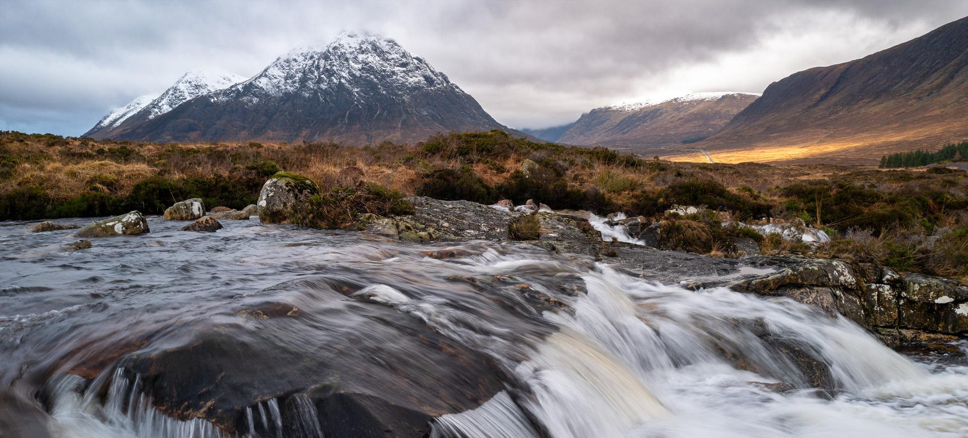
This is one of my shots from the rain-drenched Glencoe trip with Mark Stone and Aleks in Jan last year. We spent most of the time sitting in the van but did get out occasionally, and I’ve recently looked at the images and found a few half-decent ones that I had forgotten about.
I quite like it but wonder if it is a bit too central. The problem was that I was restricted in framing by some ugly buildings/road signs, so didn’t have much choice. I think the letterbox crop adds to the drama, and this is just how I like running water…with some shape and texture remaining, however I realise these are just personal preferences. Comments welcome, as ever.
Haha, definitely more than half-decent! Beautiful colours and a terrific viewpoint.
It seems very nicely balanced to me, but you could crop a little off the left just a little into the mountain, so that the mountain goes out of the picture fractionally above the grassland. I’m pining for just a tad more on the bottom (anti-cropping?) to see the water cascading off the rock a little more, if you have it, and it doesn’t spoil the letterboxing too much. Finally a tiny nit-pick, there’s a wee white patch crossing the right edge, probably lichen on the rock, but the teeniest bit distracting.
But all in all, I’d love to have been able to take this!
Cheers, Des 🙂
Cropped on left as Des suggested and the distracting white bit removed.
Am not sure it is as dramatic with the taller letterbox?
-
AuthorPosts

- You must be logged in to reply to this topic.