Welcome › Forums › John Clare – Porfolio Critique › Killarney Races
-
AuthorPosts
-
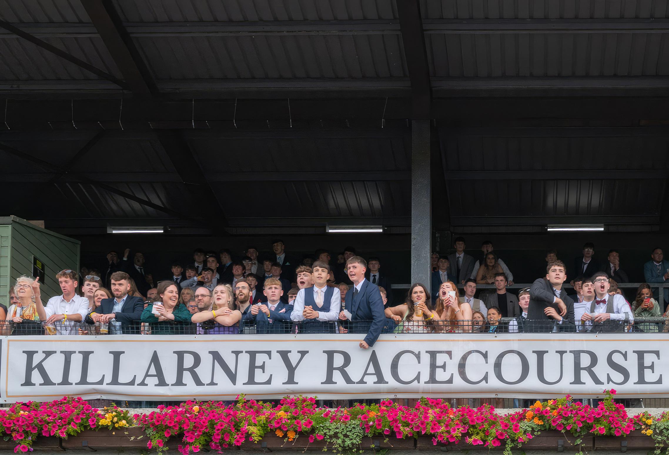
I try and produce pictures that tell a story. I was struck by the number of young people here, dressed up for a day at the races. Good expressions as their hopes rise and fall, I thought.

Hi John,
I think this is a great picture that really captures the excitement of the day. The interest is all in the faces as you intended, and the large area of the stand behind them adds nothing for me. I think I would crop the top quite hard, maybe just above the lights, to leave a strong letterbox image. I think I would also use the skew tool to pull out the top LHS and straighten the edge of the shed thing. That should also straighten the writing at that side as well. Then I would remove the vertical yellow line that surrounds the writing at the LHS so that it balances with the right. You could clone it out, although cropping off the bright edge of the shed might do that for you as well.
Best regards,
David
Excellent storytelling image, I particularly like the chap at far left giving someone the bird.
Agree with David about the cropping – although perhaps keep the reflection of the lights too.
Cheers, Des 🙂
Many thanks Dave and Des.
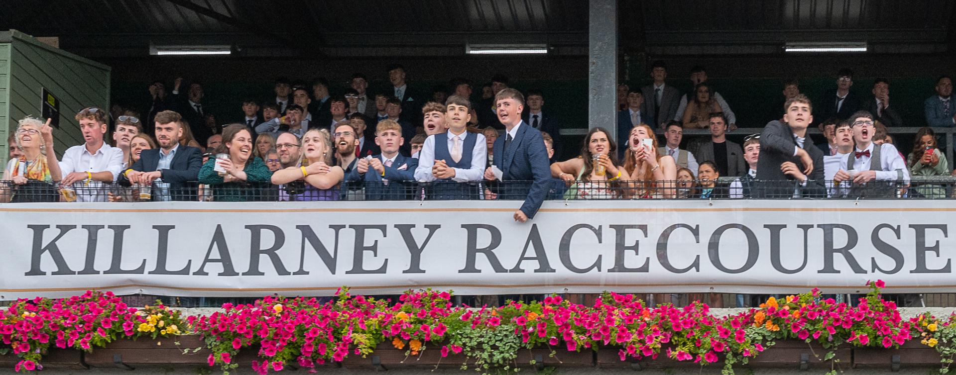
I agree. See updated image.
JC

Agree the cropped version is the strongest, you’ve really captured the excitement of the event which is more evident I this version, my only thought is that the right hand side is a bit tight to the “E” in comparison to the “K” on the left.
Rob
Agree with other comments although you could crop slightly less tight i.e. to top of light reflections as suggested by Des. Not sure why you have cropped a little from the RHS. You could use the perspective crop or skew tool as suggested by David A. to straighten the LHS which will also remove the slope on the letters on that side.
As an irregular attendee at horseracing, I am aware that we look odd photographing the crowds when the racing is behind us, but that is where the pictures are. A pleasing image of human response particularly as a letterbox.
Dave
Des was right about keeping the reflections of the lights on the roof. Perhaps you could have kept a little more of them, up to the roof beam immediately above them I would suggest. Skew tool could help get rid of the distracting bright edge of the shed thing.
David
great shot, lovely range of expressions and human emotions, letter box crop better but would crop slightly higher than you have, above the reflection of the lights as cropped version now has three lighter sections at top edge, think you could crop the lighter edge off the green shed without losing the lady on the edge of the image
-
AuthorPosts
- You must be logged in to reply to this topic.

